
UX/UI of an energy performance monitoring tool
Our approach
Which solutions? For which users?
To get started, we identified together the different types of users and their needs.
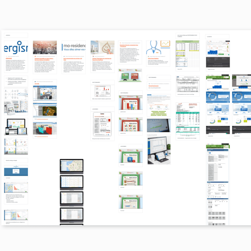
Together with Kocliko team we have identified the main user needs according to each type of user : energy optimization managers and cost individualization managers on the one hand, and tenants on the other. We then have reflected on the corresponding user journeys and analyzed the existing solutions to similar needs and user journeys, in order to identify good practices and ideas.


Two co-designed interfaces
We co-design the interface destined to be used by building managers, and the other that will be used by tenants.
We have formalized each user journey through a tree structure of the solution, which represents the starting point for our co-designing workshop.

During the workshop, we have identified the pages to be designed for both inferfaces, and have made a list of functionalities for each page. Final step consisted in co-sketching phase, by materializing information on paper.


During the two UX design sprints, we worked on wireframes architecture information.


To validate our hypothesis, we conducted short remote user tests with building managers and tenants. Wireframes have been consolidated following users feedbacks and validation from Kocliko.
Boosting information with the final touch
It is now time to transform our wireframes into dashing deliverables!

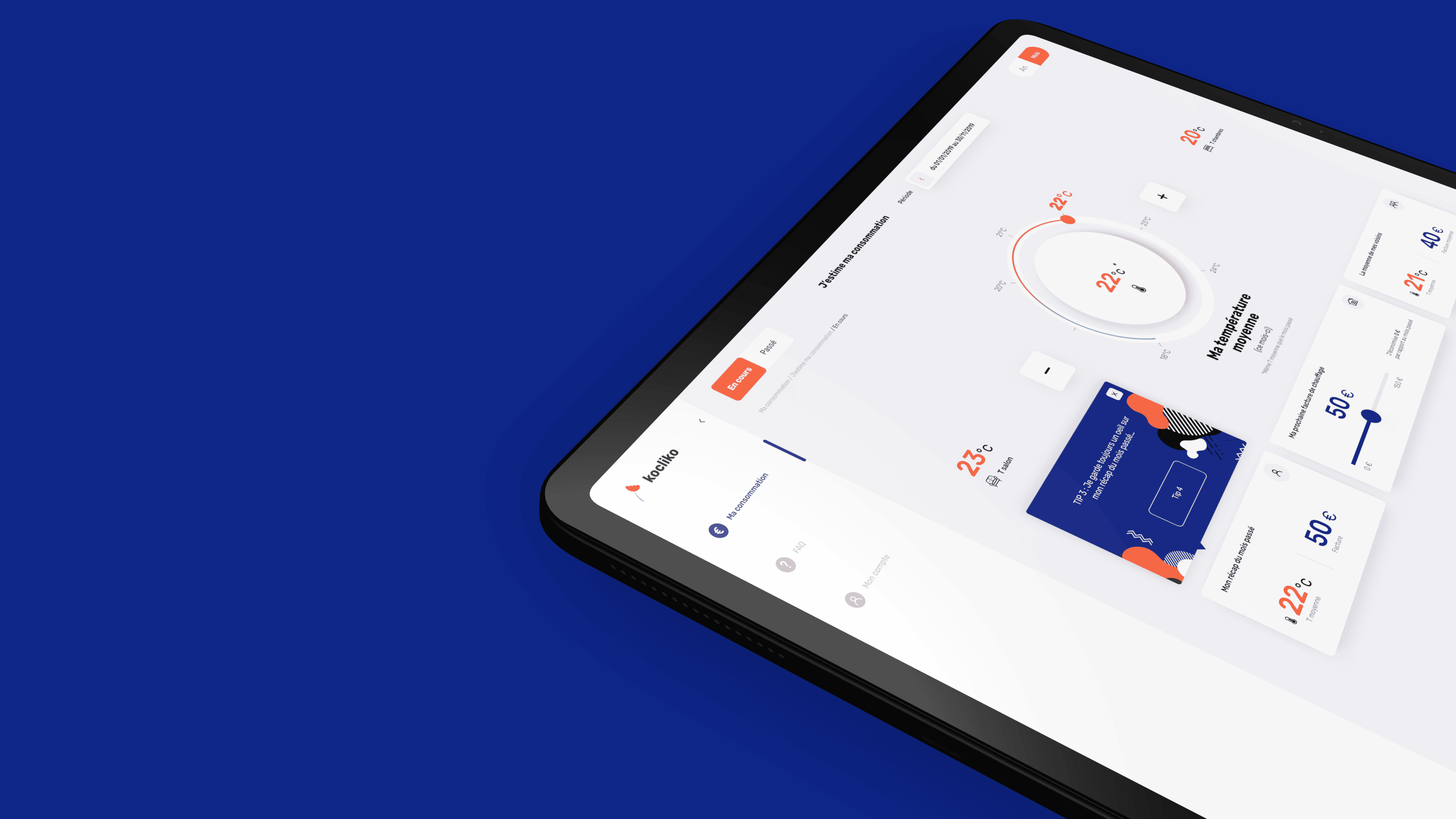
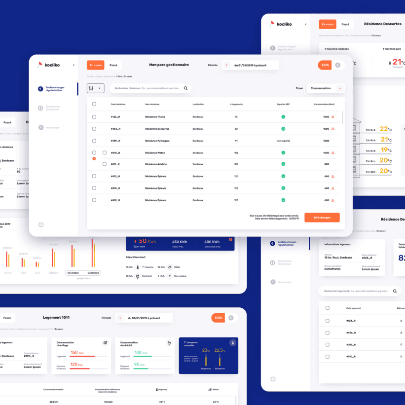
After consolidating wireframes, we have been able to move on to the final step before integration : graphic visuals.


