
Designing the global user experience of an innovative social mobile app
Our approach
Visual identity
Defining a whole graphic universe that conveys the values of this project.
The Gloo concept is rich in key words like “human”, “movement”, “reunion” or “moments”. Initially, Gloo was born from an observation: caught up in speeded-up lifestyles, we no longer take the time to get together!
The bird symbol conveys the idea that we are always in motion. Since the app helps friends get together to share a meal, the idea of merging the image of the bird with that of a fork made sense: “We are all busy with our lives, but thanks to Gloo, we can fly and meet at the same place to share a moment together.”

The app’s brand image needs to be as dynamic as its users.
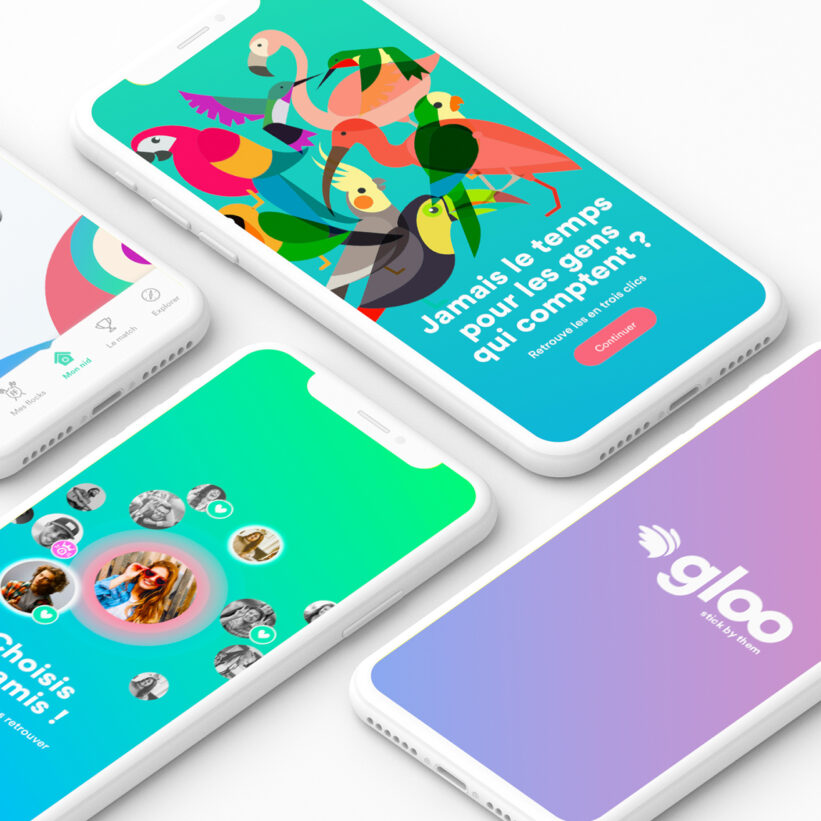
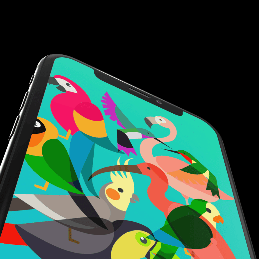
A colorful and fun universe is built, around feathery mascots. The color range is coherent with the visual identity. It uses the colors of tropical birds to highlight the diversity of Gloo users. Gradations express the movement of our daily lives.


Co-design workshop
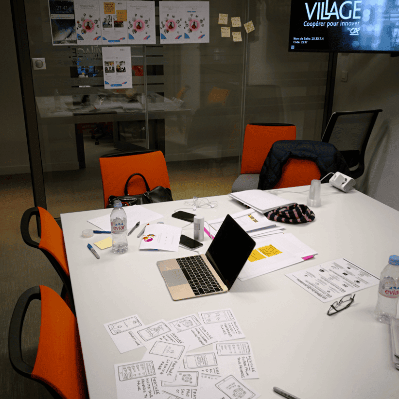
Sketching, user flows and storyboards!
This method is a great way to have users and UX designers working together during collaborative workshops.
They have several objectives: need analysis, creation of the corresponding functionalities, and a first information architecture lead for the app screens.


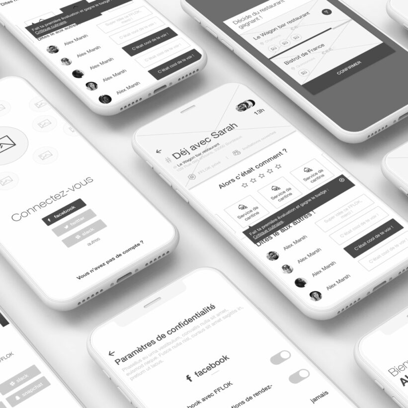
Designing wireframes
The wireframes show the information architecture and the interaction journey. They help visualize the concept and the associated features.

Graphic design: UI, marketing, and happenings
Based on the identity we defined, we have used the wireframes to produce mock-ups.
The UI design has been created for the entire app, we create visuals for the whole journey, from the onboarding to the app exit.
We work on motion design to make the graphic universe even more dynamic.

Communication media have been produced to ensure the app’s marketing on social media and during happenings.

Awesome mascots have been made by l’Equipe Costumes, based on our drawings.


